Navigator
Navigation
Pager
If your grid has only a few rows of data, then all the records will be viewable at the same time and you won't have to worry about navigating through pages of data.
But more likely, you will be dealing with large sets of data, and you'll want to display a small number of available records at a time. For this functionality, you will need the Navigation Bar.
Definition
The Navigation Bar, also known as the pager, is enabled by placing a <div> right after the <table> (your grid - the first parameter in Render method) in your HTML. Note that it is a <div>, not a <table>. Then, you identify the <div> to your grid by placing the id of the div as second parameter in Render method.
First, the HTML definition. We'll name it pager:
..
<body>
...
   <table id="grid"></table>
   <div id="pager"></div>
...
</body>
Next, we'll identify pager to the grid:
<?php
require_once 'path_to_your_project_vendor_dir/autoload.php';
...
// Create the jqGrid instance
$grid = new Guriddo\jqGrid\Render\Render($conn, 'pdo');
...
$grid->renderGrid("#grid","#pager",...);
The definition in jqGrid tell that the pager should be a part of the grid and the width of the pager will equal of the width of the grid. In this case, the pager will be placed below the body of the gird.
If you want to have custom pager you can use your own definition and not to set the pager options in the grid.
The pager when defined uses variables from language file. The English variant of these properties look like this (file grid.locale-en.js):
$.jgrid.regional["en"] = {
  defaults : {
     recordtext: "View {0} - {1} of {2}",
     emptyrecords: "No records to view",
     loadtext: "Loading...",
     savetext: "Saving...",
     pgtext : "Page {0} of {1}",
     pgfirst : "First Page",
     pglast : "Last Page",
     pgnext : "Next Page",
     pgprev : "Previous Page",
     pgrecs : "Records per Page",
     showhide: "Toggle Expand Collapse Grid"
   ...
 },
 ...
}
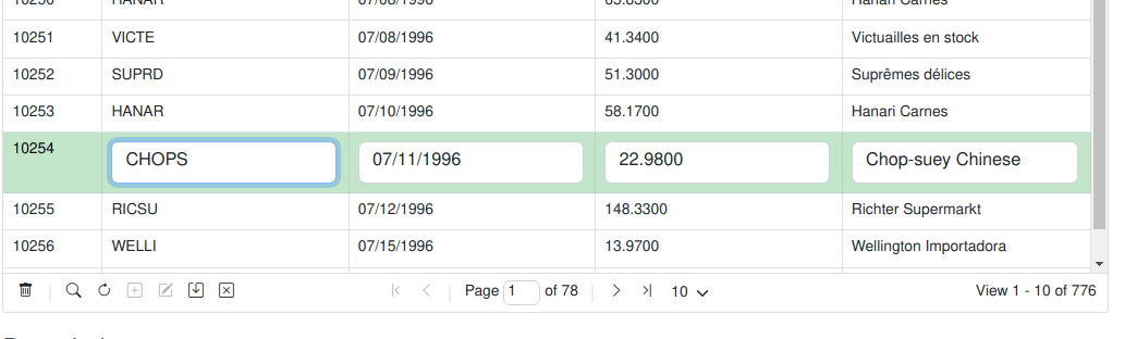
Example picture:

You can change these properties different ways depending on the needs.
- If you want globally to change these - i.e these changes will take effect in all created grids - use JavaScript after loading the jqGrid JS files in the head section. You can do:
jQuery.extend(jQuery.jgrid.defaults,{emptyrecords: "Nothing to display",...});
or
jQuery.extend(jQuery.jgrid.regional["en"].defaults,{emptyrecords: "Nothing to display",...});
both are valid
- In case you want to change this only for the particular grid, it can be done with PHP using setGridOptions:
<?php
require_once 'path_to_your_project_vendor_dir/autoload.php';
...
// Create the jqGrid instance
$grid = new Guriddo\jqGrid\Render\Render($conn, 'pdo');
$grid->setGridOptions(array("emptyrecords" => "Nothing to display"));
Normally, the pager placed so it appears at the bottom of the grid. A duplicate pager can also be enabled to appear at the top of the grid (above the header of the grid). In this case the grid option toppager should be set to true. In case when top pager is true the id of the top pager = id of the grid + "_toppager".
Normally when we create the pager we divide this element on three equal parts - left, center and right part. When you try to place additional information in the pager the pager try to fit the size. In case if you plan to place a lot of elements you should accordingly set the appropriate width of the grid or use a option to place the elements as pop up menu in the pager. See the option dropmenu in navigator options below.
By default the paging elements are placed at a center and the record information at right position of the pager. You can change these positions using the options pagerpos and recordpos - see pager options.
The icons that represent the pager buttons for navigating through the records are coded in the styleUI JavaScript object. To change the icons when using jQueryUI CSS use:
styleUI : {
  jQueryUI : {
    ...
    base : {
      ...
      icon_first : "ui-icon-seek-first",
      icon_prev : "ui-icon-seek-prev",
      icon_next: "ui-icon-seek-next",
      icon_end: "ui-icon-seek-end",
      ...
    },
  }
}
Currently it is possible to chabge the icons only with JavaScript.
Properties
The properties that are connected with the pager element are grid properties and the up to date list can be found here
Tip
The input in pgtext (where the user can change the current page) can be replaced with text information. To do this set the paremeter like this pgtext : "Page of {1}"
All the properties that can be changed in the pager after creating the jqGrid object require reloading the grid. This is done via the trigger('reloadGrid'). Here is a example which change the number of requested rows to 10.
JavaScript way:
<script>
...
jQuery("#grid_id").jqGrid('setGridParam',{rowNum:10}).trigger("reloadGrid");
...
</script>
PHP way
...
$customCode = <<< CUSTOM
    jQuery("#grid_id").jqGrid('setGridParam',{rowNum:10} ).trigger("reloadGrid");
CUSTOM;

$grid->setJSCode( $customCode );
...
Events
One JavaScript event of the grid relates to the Pager:
onPaging( pgButton )
or triggered event
jqGridPaging( event, pgButtons )
This event fires after click on [page button] and before populating the data. Also works when the user enters a new page number in the page input box (and presses [Enter]) and when the number of requested records is changed via the select box. To this event we pass only one parameter pgButton (string) which can be - first,last,prev,next in case of button click, records in case when a number of requested rows is changed and user when the user change the number of the requested page. If the string 'stop' is returned from the function then the paging will be stopped. See Selection->Master detail example of the demo.
Navigator
The Navigator is a user interface feature that allows easy accessibility to record actions such as Find or Edit. The user can activate a grid action by pressing the appropriate icon button in the Navigation layer.
Developers can create custom actions, or they can use any of the predefined actions that come with jqGrid. jqGrid provides icon button graphics for the predefined actions.
We have two types of navigators - navigator with Form Edit actions, named navGrid and navigator with Inline Edit actions named inlineNav.
Form Edit Navigator
This is method which places a predefined actions in the pager bar. By default navigaror is disabled. To enable navigator set the navigator variable to true
<?php
require_once 'path_to_your_project_vendor_dir/autoload.php';
...
// Create the jqGrid instance
$grid = new Guriddo\jqGrid\Render\Render($conn, 'pdo');
...
$grid->navigator = true;
...
Definition
With this action we enable the following actions in pager - add, edit, del, search, refresh, excel . The view action is disabled. To disable/enable action in navigator use setNavOptions method specifiyng the word navigator. If by example we want to disable adding of records the related code is:
<?php
...
$grid->navigator = true;
$grid->setNavOptions('navigator',array('add'=>false));
...
$grid->renderGrid(...);
...
Three additional predefined actions in navigator are available - pdf, csv, columns which by default are false. The columns property (column chooser) is valid only with jQuery UI CSS framework.
To define event or function related to the navigator or any of the defined above actions add, edit ..., use the setNavEvent with parameter name navigator, second parameter the name of the event and the third the javascript code. By example to add action before to press refresh button we can do this
<?php
...
$grid->navigator = true;
$beforecheck = <<<BEFORE
function()
{
    alert("Action before referesh");
}
BEFORE;
$grid->setNavEvent("navigator", "beforeRefresh", $beforecheck);
...
$grid->renderGrid(...);
...
Parameters
When we use the Navigator the following options are included from the language file.
$.jgrid.regional["en"] = {
  ...
    search : {
    ...
    },
    edit : {
    ...
    },
    view : {
    ...
    },
    del : {
    ...
    },
    nav : {
        edittext: "",
        edittitle: "Edit selected row",
        addtext:"",
        addtitle: "Add new row",
        deltext: "",
        deltitle: "Delete selected row",
        searchtext: "",
        searchtitle: "Find records",
        refreshtext: "",
        refreshtitle: "Reload Grid",
        alertcap: "Warning",
        alerttext: "Please, select row",
        viewtext: "",
        viewtitle: "View selected row",
        savetext: "",
        savetitle: "Save row",
        canceltext: "",
        canceltitle : "Cancel row editing",
        selectcaption : "Actions..."
    },
...
}
If you want to change the text that appears when a user hovers over a button, simply replace the text in the title string in the bottom part of the code below. For example: hover text for the view button is supplied by viewtitle: "View selected row"
Another way to change this for the particular grid is to use navigator parameter in setNavOptions method.
<?php
...
$grid->navigator = true;
$grid->setNavOptions('navigator',array('viewtitle'=>'My view title'));
...
The full up to date list of parameters is listed here
Additionally to every particular module defined with edit, ed, del, ... etc a id parameter can be passed in order to identify the id of the button in the Navigator. If this id is not defined we use the combination of a prefix and the grid id. See below.
If the id of the button is not set we use the following rule:
For the add button we use “add_” + the id of the grid
For the edit button we use “edit_” + the id of the grid
For the delete button we use “del_” + the id of the grid
For the view button we use “view_” + the id of the grid
For the search button we use “search_” + the id of the grid
For the refresh button we use “refresh_” + the id of the grid
For the excel button we use pager id + “_excel”
For the csv button we use pager id + "_csv"
For the pdf button we use pager id + “_pdf”
For the columns button we use pager id + “_col”
The button and action can be disabled when a certain class is added for it. This class is defined in the common styleUI module with the name disabled:
styleUI : {
  jQueryUI : {
    common : {
      disabled: "ui-state-disabled",
      ...
    }
  }
  ...
}
for Bootstrap
Bootstrap : {
  common : {
    disabled: "ui-disabled",
  }
}
To make this cross CSS usable add the two classes at once. If the button has a id = myedit as of the example above use this code to disable it dynamically:
...
$("#myedit", "#pager").addClass('ui-state-disabled  ui-disabled');
More options
In some cases we need to have easy access to the navigator options and parameters of the editing. To do so we have created a grid option (note that this is a grid and not navigator option) called storeNavOptions see options
This is a boolean option and if set to true when the navigator is created it stores the navigator, editing and search options in the following grid options:
- navOptions- object where all the navigator objects are stored as grid option.
- editOptions - object where all the edit parameters passed in navigator are stored as grid option.
- addOptions - object where all the add parameters passed in navigator are stored as grid option.
- delOptions - object where all the delete parameters passed in navigator are stored as grid option.
- viewOptions - object where all the view parameters passed in navigator are stored as grid option.
- searchOptions - object where all the search parameters passed in navigator are stored as grid option.
- navButtons - array where all the custom buttons created with navButtonAdd are stored as grid option
The primary goal of creating this option is caused of creating the methods for saving/restoring the grid state - $.jgrid.saveState and $.jgrid.loadState where we have access only to the grid options. We do not store these options automatically because of saving memory.
Inline Edit Navigator
Definition
The inline navigator is similar to the form navigator except that a inline editing actions are used.
The full set of predefined actions in this navigator are:
1)Add New Row, 2) Edit Selected Row, 3) Save the Selected Row 4) Cancel saving the row
The image below shows these four buttons in the bottom-left.
To setup Inline Edit Navigator use the setInlineNav php method:
<?php
...
$grid->setInlineNav();
...
$grid->renderGrid(...);
...
When calling this method enable the toolbar navigator disables edit, add and view form actions and create four inline actions described above.
Additionally to every action button a id parameter is set. The unique id for every button is build as follow:
For the add button grid id + '_iladd'
For the edit button grid id + '_iledit'
For the save button grid id + '_ilsave'
For the cancel button grid id + '_ilcancel'
The following options from language file are used when this method is called (English version):
$.jgrid.regional["en"] = {
  ...
    nav : {
        edittext: "",
        edittitle: "Edit selected row",
        addtext:"",
        addtitle: "Add new row",
        deltext: "",
        deltitle: "Delete selected row",
        searchtext: "",
        searchtitle: "Find records",
        refreshtext: "",
        refreshtitle: "Reload Grid",
        alertcap: "Warning",
        alerttext: "Please, select row",
        viewtext: "",
        viewtitle: "View selected row",
        savetext: "",
        savetitle: "Save row",
        canceltext: "",
        canceltitle : "Cancel row editing",
        selectcaption : "Actions..."
    },
...
}
Parameters inlineNav
The up to date list of all available inline navigator options is listed here
To change inline options use the method inlineNavOptions with first parameter module and the second the options. The possible values for the first parameter are - navigator, edit, add and the second parameter is array of options. To add a action before adding a new row when inline is used we can do it like this:
<?php
...
$grid->setInlineNav();
$inlineAdd = <<<INLINEADD
function()
{
alert("oneditfunc");
}
INLINEADD;
$grid->inlineNavOptions('add', array("addRowParams"=>array('oneditfunc'=> "js:".$inlineAdd)));
...
The same code can be achieved when using inlineNavEvent function.
<?php
...
$grid->setInlineNav();
$inlineAdd = <<<INLINEADD
function()
{
alert("oneditfunc");
}
INLINEADD;
$grid->inlineNavevent('add', 'oneditfunc', $inlineAdd );
...
Custom Buttons
Custom Buttons are a way to define your own button and action in the pager.
The creation of custom button should be done with callGridMethod where the seciond parameter is navButtonAdd
something like:
$grid->callGridMethod("#grid", "navButtonAdd", $buttonoptions);
where $buttonoptions is array containing the options
The default options are:
- caption: (string) the caption of the button, can be a empty string.
- buttonicon: (string) is the ui icon name from UI theme icon set. If this option is set to “none” only the text appear.
- onClickButton: (function) action to be performed when a button is clicked. Default null.
- position: (“first” or “last”) the position where the button will be added (i.e., before or after the standard buttons).
- title: (string) a tool-tip for the button.
- cursor : string (default pointer) determines the cursor when we mouse-over the element
- id : string (optional) - if set defines the id of the button (actually the id of TD element) for future manipulation
<?php
....
$buttonoptions = array("#pager",
    array("caption"=>"Pdf",
    "title"=>"Export to Pdf",
    "onClickButton"=>"js: function(){
        jQuery('#grid').jqGrid('excelExport',{tag:'pdf', url:'$url'});
    }"
    )
);
$grid->callGridMethod("#grid", "navButtonAdd", $buttonoptions);
With the above example we add a custom button which do export to pdf.